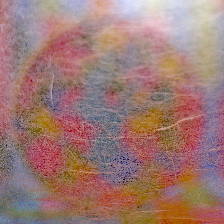
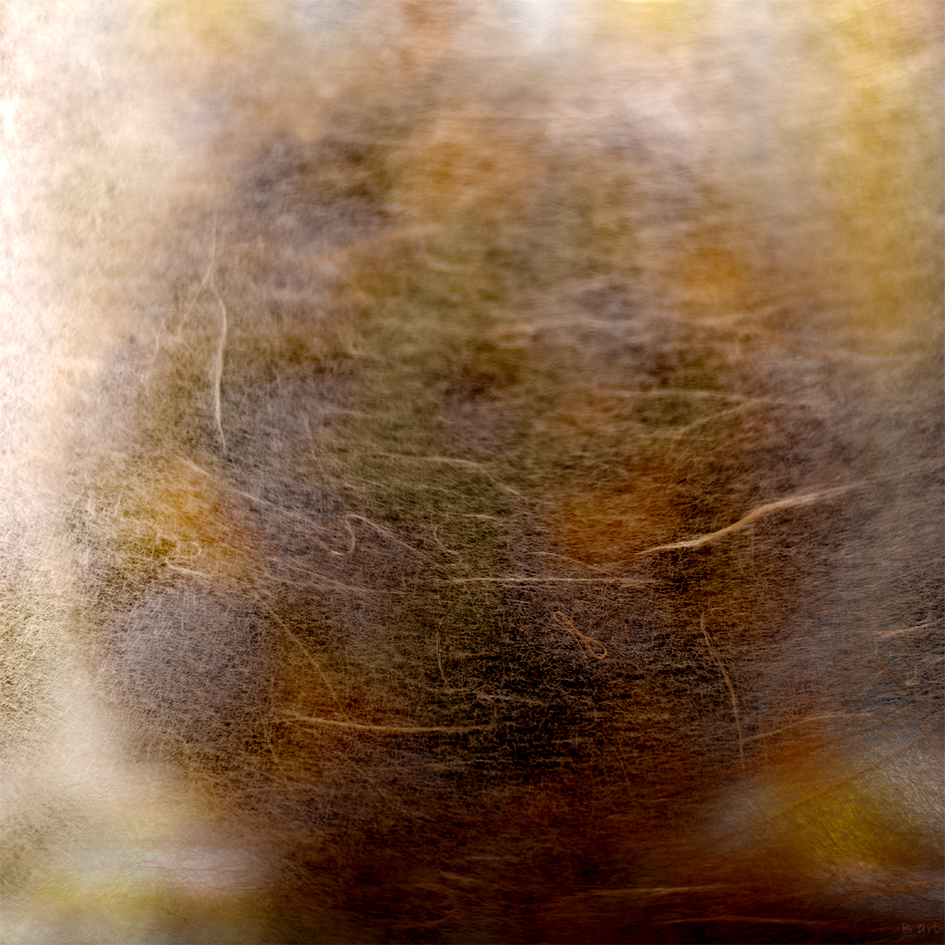
I was wondering how different colors were able to contribute with a contour or shape. The purpose is to look at this image on 1 meter scale on a white or grey wall but not black. I used different colors with different objects from different materials (paper, plastic, glass & cotton fibers) and tried to find out a suitable combination of it on right exposure with flash lights. I did not use various filters or layers. I added 8 % black . I believe the ratio 1:1 is the best choice . It expresses the content rather the shape. However I did not like the dominant circular shape. The second image below , I like . I de-saturated the red colors and this became the results.
I was inspired by the music of ” solar fields -Third Tile ( version A)”. Maybe you can understand what was driven me to make this image.
Feel free to add comments . If you don’t like this combination , feel free to explain why. I appreciate your time for me.

Leave a reply to Jane Eve Dixon Cancel reply